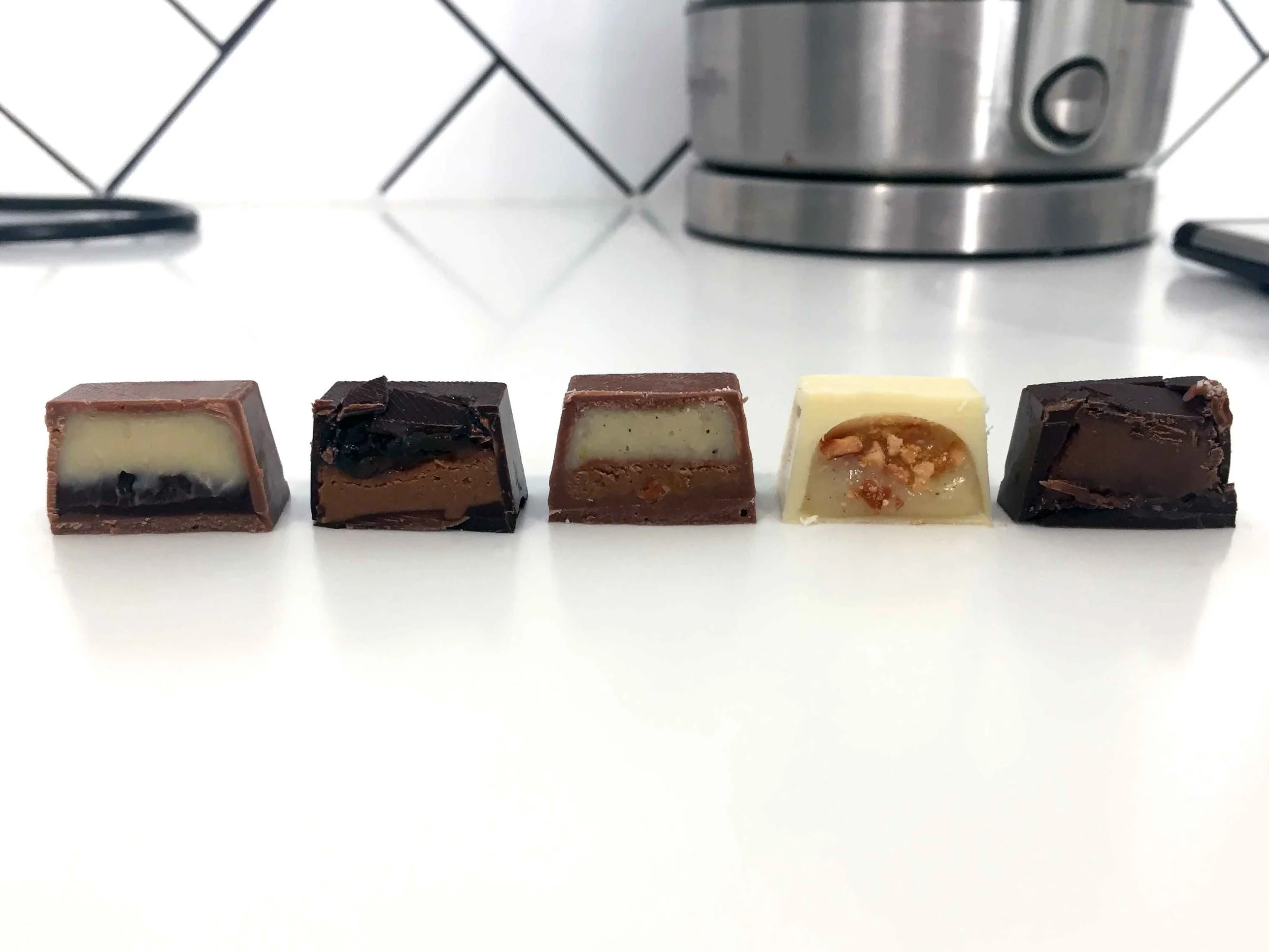
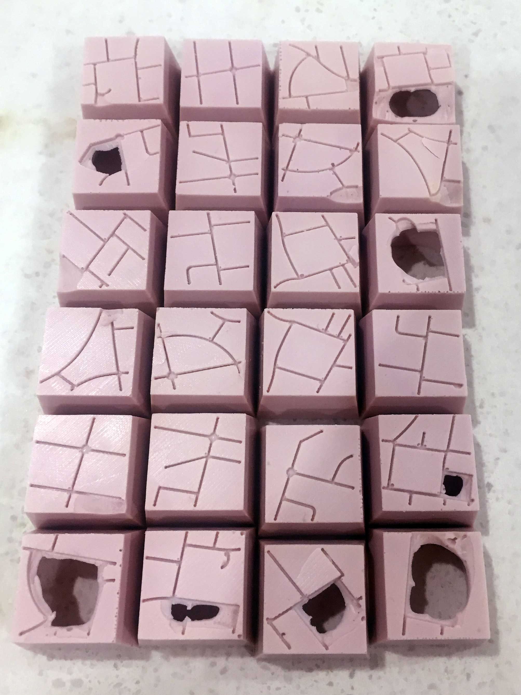
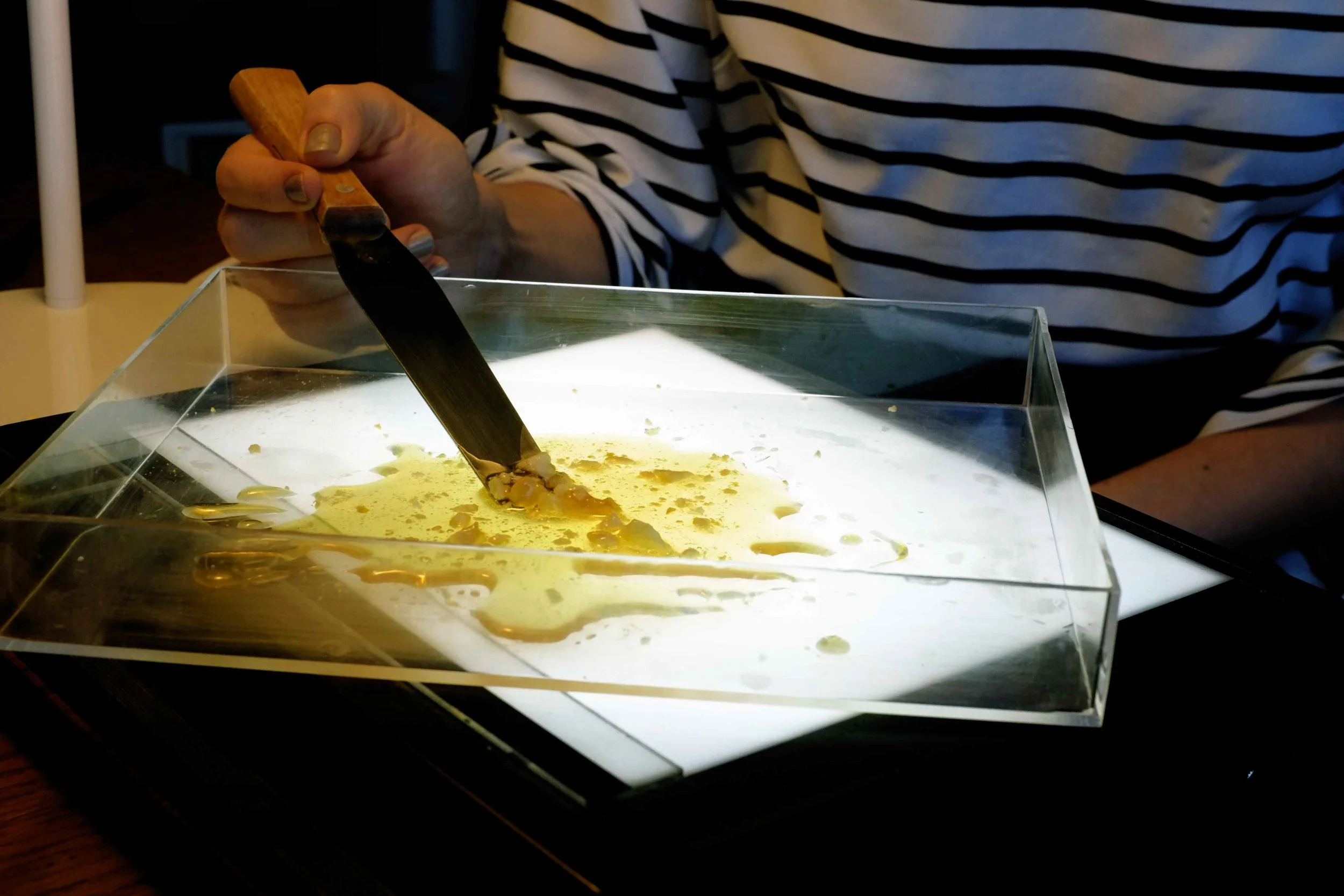
OUR PROCESS

Packaging-NOSA.jpg
 

How we translated census data into chocolate

At Small Multiples, our day-to-day work involves interpreting data and communicating complex ideas, through a predominantly online and digital medium. The world is filled with information that is traditionally conveyed through sounds and visuals, but we wanted to try exploring data through other senses such as touch, taste and smell to see how consumers would respond.

It was only natural to choose chocolate as the information carrier for our experiment - after all, who doesn’t love chocolate?


the data


Measuring diversity

Electing the most representative data for different ancestry cohorts is vital. We picked “Ancestry” from the Australian Bureau of Statistics population census the as the most suitable indicator - people’s origin or ethnic descent, we thought, tells a better story about their cultural and familiar origins than language or birthplace.

In order to convey the unique relationship between suburbs and culture, further data manipulation was necessary. This included assigning unique suburb/ancestry pairings, where the ancestry was prominent (in the top 3, excluding Australian) and the ancestry population in the suburb was large enough (over 300) to warrant significant influence. 

Starting with ancestries, these were categorised into global regions, building further upon ABS ancestry groups to visualise the ethnic makeup of the Greater Sydney population. (One important note is that “Australia” as an ancestry was excluded, since we are focusing on external origins of the population.)
 

In order to apply the same distribution across the 12 chocolates, global region percentages was converted to “chocolate pieces” - equal to about 8.34%. This translated to the fact that some global regions were too small to be included (specifically Pacific Islands, America and Asia), leaving Europe to 7 chocolates, Asia to 4 chocolate and Middle East to 1 chocolate piece.

To further select specific ancestries within each global region, a formula was devised to determine the most prevalent ancestries among suburbs, based on both the number of people and the ancestry percentage of the population. From this list, we ranked all suburbs based on their weighted ancestry value, and selected the first 12 that fit the criteria. 

The final twelve suburbs and their prominent ancestries can be further explored in the interactive map below.


The Flavours


Diversity as taste

Many different components contribute to taste of a single chocolate - texture, balance of flavour, smell and even colour. We wanted the flavours of each chocolate to be unique enough to stand on its own, but at the same time accurately portray its corresponding ancestry. 

Through preliminary research, we compiled a list of possible ingredients, desserts and flavours for each of the ancestries. Bakedown Cakery took over from here, composing and experimenting with ingredients, as well as providing further research into the cultures surrounding these ancestries.

Narrowing down to twelve chocolate flavours, we had to further test the validity of our decisions. We conducted a couple of small online studies to determine which combination of ingredients evoked a strong mental association with a particular ancestry.

Flavour index:

  1. Red bean, coconut and mandarin

  2. Caramel, banana, coffee and peanut

  3. Saffron rosewater, rum soaked raisins and pistachio

  4. Taro, coconut and sesame

  5. Honey and orange blossom, cashews and pistachio

  6. Scotch whisky and toffee

  7. Almond and glacé cherry

  8. Lemon, Ouzo and anise

  9. Bailey’s, coffee and honeycomb

  10. Strawberry, Orelys and balsamic caramel

  11. Orange, vanilla cinnamon and almond

  12. Peach, rhubarb and honey

As you can see strong associations form on the more well-known flavours, that have a clear and widespread knowledge. There is always the challenge of being accurate to the ancestry while at the same time stereotypical enough to be recognised by the general public.

Bakedown Cakery took this data and adjusted flavours where necessary - especially when a certain flavour was strongly interpreted as another, which was the case for Indian (originally rosewater, raisins and pistachio) and Lebanese (originally honey, orange and cashews). We conducted another small experiment, asking users to blind taste the chocolates and detect the ancestry. Although most of the obvious flavours were recognised - such as the Baileys for Irish and red bean paste for Chinese - we discovered just how difficult it is to pin down flavours without any prior visual or verbal indicators. This became a major consideration for the design of the packaging, as we need to develop visual cues that would further enhance the experience of eating these data-filled chocolates..

The final 12 flavours can only be described as incredibly complex and uniquely delicious, bursting with flavours that are not from a single origin.


The chocolates


Location as form

As the ancestry population is within the boundaries of a suburb, the same concept can be applied to the chocolate pieces. The exterior shell must visualise the distinct features of the suburb area, just as the fillings inside represent the ancestry.

The concept of a suburb instantly prompts visuals of grid-like streets, rows of houses and greenery - all quite similar, but how to highlight the individuality of each? By focusing on spatial data, particularly street maps, we are able to communicate how different suburbs were built and are utilised, which in turn influences the lifestyle of its residents.

Twelve excerpts from our selected suburbs below show vast differences, as some border spacious parks and ocean views, while others surround highways and dense streets. By selecting the extremes of each suburb - such as the curved beach roads of Manly or the structured grid of Hurstville - we are able to convey further insight for each area.
 

Working together with Bakedown Cakery, we searched for the best approach when transferring the map design to the chocolate shell. From a technical perspective, two options were the most viable:

1. Chocolate transfer sheets

In this process coloured cocoa butter sheets are printed onto thin acetate. When the melted chocolate is poured over the sheets, the cocoa butter slightly melts (but not enough to affect the design) and sticks to the chocolate.

These would allow a high level of detail in regards to the map design, however the colour accuracy will vary depending on the chocolate base. 

In order to test the colour payoff with darker chocolates, a test print was organised, containing 48 colours and a variety of geometric and organic shapes.

Chocolate-Transfers.jpg

As obvious in the photo, the dark chocolate barely shows any colour, the milk chocolate features more of the red and blue hues, while the white chocolate retained the most accurate results. 

Because of the inconsistencies between chocolate bases, one option would be to include a white chocolate disk (with the printed map design) on top of every chocolate piece. However this compromises the harmony of carefully selected flavours, as the white chocolate is quite sweet and overpowering - even in small quantities.

As a result, this option would be almost impossible to implement in a way where both colour and flavour accuracy are met to a high standard.

2. Magnetic mold with a 3D printed base

The second option is to use a magnetic chocolate mold, adding a custom 3D printed base in between the metal backing and the mold. This would achieve impressions of the map design when the chocolate is poured and set inside the mold.

It took quite a few rounds of testing and experimentation to get the exact width, depth and density of the impressions just right. We started by modelling and 3D printing individual stamps, to rapidly iterate through many variables and combinations.

Chocolate-Stamps-2.jpg

During this process we discovered that any print with a dense or overly complicated design had a high likelihood of sticking to the chocolate. As a result, the scale of the maps had to be larger, showing only a few street blocks at the most. The line width also had to be thinner than 1mm to balance the delicate aesthetic of the chocolate piece.

From here we tweaked and tinkered with the street vectors to achieve somewhat of a uniformed look while still keeping each suburb’s individuality visible. It was also important that all chocolates have the same scale, even if the streets don’t exactly match to the real world equivalent.

Once we settled on the final designs for all the suburbs, we continued to test tray prints (like the one below) with our in-house 3D printer. We determined that even 0.5mm line depth was too deep, as this caused the chocolate shells to crack - and if the shells were any thicker very little of the filling would be encased inside. The goldilocks measurements ended up being 0.5mm line width and 0.3mm depth, with at least 0.5mm margin around the perimeter to ensure that the tray fits inside the mold. 

Final-Suburbs.jpg

One major issue with 3D printing parts that are to be used with food is toxicity. For our test prints we used a standard PLA filament, but as we needed food safe materials for the real product, we used PETG plastic filament (similar to those found in water bottles). Since we needed large quantities of trays (72 in total), we outsourced the 3D printing - across three or four different suppliers - because of the lengthy duration of a single print. This resulted in many inconsistencies across the prints, even as they were printed with the same material and using the same model - sometimes even with the same supplier. However we managed to salvage just enough trays to continue with production in a relatively timely manner. As most trays had slight diagonal textures across the entire tray, this actually helped in the end by hiding all the small imperfections, creating a more handmade aesthetic. 

Our final chocolates turned out imperfectly perfect, with delicate fine lines depicting the stories of the people who reside within our Sydney suburbs.

layout.jpg
 

The packaging


Data as art 

As is the chocolate, the box itself was never meant to be simple. It must intrigue at first glance, entice you to lift the lid and tempt you with the indulgent chocolate pieces.

To achieve this effect, we had to create an experience that contained a certain mystery to prompt further interaction. The exterior should be exciting, and just suggestive enough to hint at something food-related. Once the box is opened, an introduction on the inside of the lid explains the concept behind Not A Single Origin. Each chocolate piece is labelled with a suburb, with the promise of each representing an ancestry. The act of eating chocolate becomes gamified, prompting a desire to guess and reveal the ancestry underneath each confection. 

sketch-packaging.jpg

To create the exterior packaging design, we explored a wide range of styles - from vector-based minimalism to photographic realism, and ended up somewhere in-between. To borrow from reality, we utilised the ingredients contained within the chocolate fillings to create a surreal collage of flavours. 

We sliced, diced, crushed and smeared food to produce interesting textures. Through the use of photography and a lightbox we captured the finer details of fruits, nuts, jams, spices and confectionary. 

lemon-slices.jpg

In post processing, we began composing all images together to in order to create a mysteriously harmonic and beautifully eccentric artwork. But one element was missing - colour. Colour communicates a lot about food, suggesting flavour, taste and the general appeal. While original tones and hues of the natural ingredients were quite appetising, they are neither intriguing nor exciting. By using a gradient map, we were able to apply the brightest colours CMYK can handle, to produce an almost hyperreal reality out of digital pixels. 

unprocessed-collage.jpg

Taking it a step further, we developed a program which twists, warps and destroys a collage of natural ingredients into an otherworldly terrain bursting with the colours and vibrancy of Sydney's multicultural makeup. It functions by detecting areas of light and dark, reconstructing these vertical blocks out of digital strokes. Finally we have achieved our initial goal of creating enough mystique to enthrall the audience.

The rest of the packaging design fell into place, as we wanted to keep the interior relatively minimalistic to maintain focus on the actual chocolates. 

p7789555_2942873640_6.jpg